
The Search Brief · News analysis
Agent-Friendly Forms Start With Clear Labels and Recoverable Tasks
Make forms clear for people and authorized agents with semantic labels, visible constraints, recoverable errors and verified task completion.
Development covered: Primary documentation checked November 2, 2026
Agent-friendly forms make the purpose, expected input, current state, and result of a task clear. Start with sound semantic controls and visible instructions, then verify that a person using a keyboard and an authorized agent can complete the same real task without guessing what a field means. A visually attractive form is incomplete if its labels, conditions, errors, or confirmation are ambiguous.
This is an interaction-design objective, not a new search ranking guarantee. Accessible form practices serve people directly and create clearer interfaces for systems that operate through page semantics. They do not prove that every agent will understand the page or that a search engine will rank it differently. Test the actual task and report the observed behavior.
Labels identify the requested information
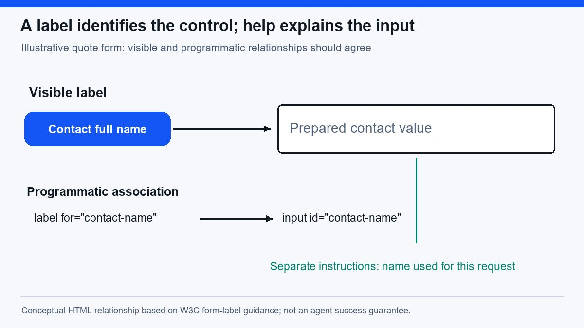
W3C’s forms tutorial explains ways to associate labels with controls, including explicit relationships between a label and its input. It distinguishes labels from additional instructions and covers cases where a visible label is not the only relevant design consideration. This guidance provides the accessibility foundation; it does not define an agent-specific ranking score. W3C guidance on labelling controls.
For a website team, the practical question is whether each control has an understandable name and purpose in the interface actually delivered. An input labelled “Name” can be ambiguous in a quote form that asks for both a person and an organization. “Contact full name” and “Organization name” establish the distinction without requiring the user to infer meaning from position.
A placeholder is weak as the only instruction because it can disappear when input begins. A field value should not erase the explanation a person needs to check their work. Keep important requirements visible, and ensure the label relationship is programmatic rather than merely a nearby line of text that happens to look associated.
Do not make labels verbose substitutes for all help content. A concise name identifies the field; nearby instructions explain format, scope, and constraints. A budget input might be named “Estimated monthly budget” with separate currency and range guidance. Combining everything into an enormous label can make the form harder to navigate.
Begin with the task contract
Write down what the user is trying to accomplish, what information is required, what the system will do, and what counts as completion. A quote request is not a purchase. A saved draft is not a submitted inquiry. A successful validation check is not confirmation that a recipient received the request.
For a fictional agency quote form, the task might be: submit a request for an SEO consultation using a contact name, work email, website, service need, and preferred contact method. Optional fields might include budget and project timing. The form should identify those requirements and avoid implying that optional information is necessary merely because a layout leaves no visible distinction.
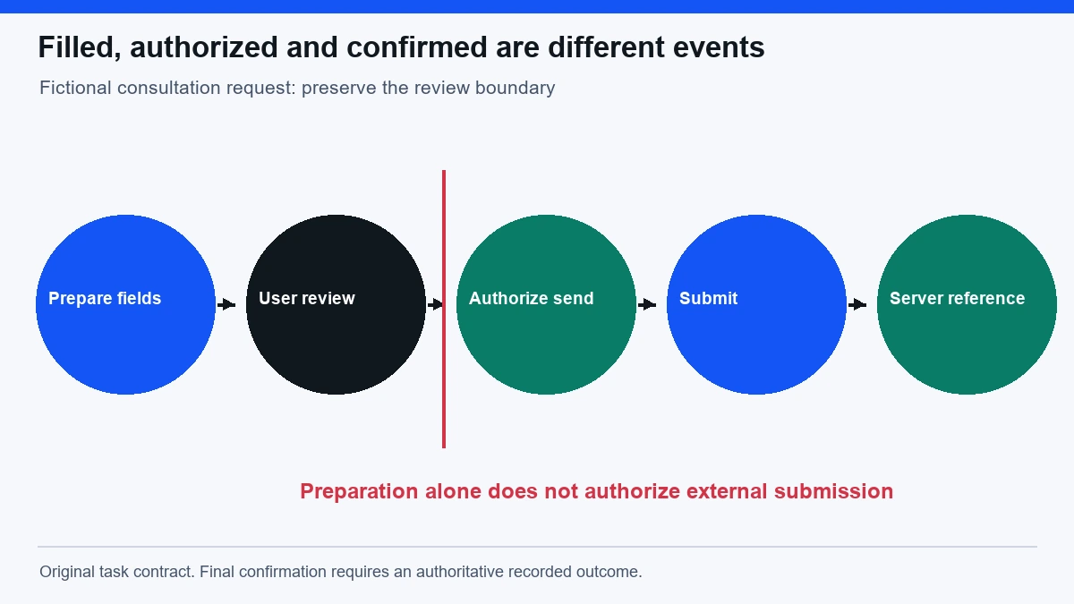
The task contract also defines what is outside scope. A user asking an agent to compare agencies has not necessarily asked it to send inquiries. A form that is easy to operate should still preserve the boundary between research and external submission. Clear interface design does not replace the user’s authorization.
Use search intent alignment to decide whether the page should primarily explain an offer, collect a quote request, or support a comparison. Those different tasks need different information and next actions. A form cannot compensate for a page that promises the wrong outcome.
Give grouped choices a shared meaning
A set of radio buttons needs a question that identifies what the choices answer. “Email” and “Phone” are understandable only when the group means preferred contact method. Without that context, they could refer to account verification or billing delivery. Group labels should make the relationship explicit.
Checkboxes also need clear scope. “I agree” does not tell a user what agreement is being made. A marketing subscription, privacy acknowledgement, and authorization to submit a request are different decisions. Do not combine them into an ambiguous control or preselect a consequential choice merely to simplify completion.
For multi-select services, explain whether choices are independent and whether a minimum is required. If selecting a service reveals additional fields, identify the new requirements in the updated interface. An agent should not have to infer that a previously optional region field became mandatory because a new panel appeared lower on the page.
Native controls are a useful starting point because they provide established interaction behavior. Custom components require careful implementation and testing of names, roles, states, keyboard use, and focus. A decorative card that looks like a checkbox does not automatically expose checkbox behavior to other interaction methods.
Make constraints available before submission
If a field requires a particular format, say so near the field. A website input can accept a complete URL or a domain, but the expected format should be clear. An international phone field should not silently reject valid numbers because its implementation assumes one country’s length. Align constraints with the audience the business actually serves.
Explain ranges and units. A budget of “5,000” is ambiguous without currency and period. A project date may mean desired start, desired completion, or availability for a call. Those differences matter commercially and should not be resolved by an agent guessing from a generic field name.
Avoid collecting information that the task does not require. Every extra field creates another chance for confusion and another data-handling obligation. An optional note can be useful, but a request for sensitive account credentials is inappropriate for an ordinary quote inquiry. Keep the form aligned with the actual service and submission process.
Validate on the server as well as supporting useful client-side feedback. A browser hint is not the authoritative acceptance rule. The submitted data should be checked consistently, and the returned errors should identify what needs correction. A form that accepts invalid information visually and rejects it silently later has not completed the user’s task.
A worked quote request example
Imagine a fictional visitor who wants a technical SEO consultation for a retail website. They authorize an agent to prepare a quote request but want to review it before submission. The agent can fill the contact name, work email, website, service need, and preferred contact method. It should stop at the review boundary rather than treating a filled form as permission to send.
The review summary should show the information that will be submitted in ordinary language. If the budget field is optional and unknown, it should remain blank or explicitly unspecified according to the form’s rules. The agent should not invent a budget because the field is visually prominent or because a plausible number would make the form look complete.
Suppose the website field rejects a domain without a scheme. The error should identify the field and explain the accepted format. The user or agent can then correct the input without losing unrelated values. “Something went wrong” provides no reliable repair path and encourages repeated submission attempts.
After the user authorizes submission, the system should distinguish a pending request from a confirmed one. A confirmation can include a request identifier and the relevant next step. It should not promise a response deadline unless the business actually commits to it. The interface must accurately describe the operational outcome, not merely display a celebratory animation.
Preserve data during recoverable errors
A validation error should not force the user to re-enter the entire form. Preserve valid values where appropriate, identify the affected fields, and keep the correction path clear. A person using a keyboard should be able to locate the error and return to the relevant control without searching visually across the whole page.
Network uncertainty requires a different response from invalid input. If the request may have reached the server but confirmation did not return, the form should not casually encourage another independent submission. The system needs a way to check the original outcome or safely retry the same attempt. Otherwise, an agent trying to recover can create duplicate inquiries.
Do not describe every failure as a user mistake. A service outage, expired session, missing authorization, validation rejection, and unknown submission result are different states. The explanation should identify the actual condition and the appropriate next action. Clear categories also make operational monitoring more useful.
Test whether errors remain understandable in the representations used by different interaction methods. A red border without text can be invisible to some users and uninformative to an agent. A message detached from its control can leave the correction target uncertain. Color can reinforce meaning, but it should not carry the entire explanation.
Verify the whole path under real conditions
Begin with keyboard navigation through the rendered page. Check the sequence of controls, visible focus, group behavior, conditional sections, review summary, submission, errors, and confirmation. Then test the authorized agent’s actual task using its supported interaction method. A passing component snapshot does not establish successful end-to-end completion.
Use realistic values and edge cases. Include a long organization name, an international contact format if supported, a website with a subdomain, and a service choice that reveals another requirement. Include a correction after an error and a return from the review step. These cases expose relationships that a single ideal submission can miss.
Inspect behavior under delayed responses and interrupted connections. A loading state should not disappear while the request continues invisibly. A disabled button should not remain disabled after a recoverable error. A confirmation should correspond to a recorded server outcome. The evidence should connect user input through validation and submission to confirmed output.
Use the technical SEO checklist for the surrounding page’s delivery and rendering checks, while keeping form task completion as its own test. A page can be crawlable and still contain a broken interaction. Conversely, an authenticated form can work correctly while intentionally remaining outside public search discovery.
Keep the source and action pages connected
A service page should explain what information a quote request requires before sending the visitor to the form. A detailed guide can clarify the service scope, while the form performs the action. Connect those resources with descriptive links so that the reader can understand the offer and return to the appropriate next step.
The internal linking checklist helps verify those paths without turning every article into a repetitive collection of conversion links. Place the form link where the reader has enough context to choose it. Avoid routing unrelated research tasks directly into a submission flow that assumes purchase intent.
If the form has several entry points, preserve meaningful context without preselecting commitments the user did not make. A service category can be suggested from the originating page, but the user should be able to inspect and change it. Hidden assumptions about location, budget, or urgency can produce a misleading request even when every field is technically valid.
Questions for an agent-friendly form review
Does adding an accessible label guarantee agent success? No. It improves the interface’s clarity and accessibility foundation, but the agent still has to interpret the task, provide accurate values, respect authorization, and verify the outcome. Test the actual supported system and retain failures rather than assuming semantic markup completes the work.
Should a site create a separate hidden form for agents? There is no general need to duplicate the human task with an unverified hidden interface. Start by making the real form clear and reliable. If a structured integration is later added, it needs its own documented permissions, validation, and confirmation behavior, aligned with the same business rules.
What should a completion report say? State which task variants were tested, which interaction methods were used, what the server confirmed, and which failures remain. Distinguish a successful local test from a deployed repair and fresh operational success. Do not call the form fixed merely because the page loads or its controls have names.
What is the first useful repair? Find the earliest point where the user must guess: an ambiguous field, missing unit, unexplained conditional requirement, vague error, or uncertain result. Repair that point, test the affected path, and confirm the downstream outcome. A focused change with clear evidence is more useful than a generic agent-readiness score.
Retain a task-level evidence record
For each tested route, save the input class, selected service, required fields, observed errors, submission attempt identity, and final confirmation state. Avoid storing unnecessary personal information in diagnostic logs. The record should establish what happened without turning observability into indiscriminate data collection. When a defect is repaired, compare the same route before and after the change and include a fresh operational observation where available. This preserves the distinction between a component that appears healthy and a visitor task that actually reaches its intended outcome.